Food Stash Foundation x FLUI Design Jam


Designing a more user-friendly website for Food Stash Foundation
Role
Designer
Timeline
February 2026
2 days
Team
1 Media Editor
3 Designers
Skills
Product Design
Usability Testing
User Research
Rapid Prototyping
Overview
Food Stash is a non-profit initiative dedicated to reducing food waste and providing dignified food access to promote a thriving planet and health community. My primary role was to prototype and lead the creative direction of the new website, in addition to identifying and solving the main pain points of the current website.
Our Main Goals…
Create a more user-friendly and engaging experience that encourages action and supports revenue growth
Streamline user pathways to increase conversions
Support Revenue growth through clear call-to-actions
We began by auditing the current information structure to identify friction points. Key information was fragmented and embedded within dense, information-heavy layouts, making navigation inefficient and increasing the effort required to find actionable information.

Each colour represents a different category. Not only was there an overload of information, it also became overwhelming to navigate.
Users are interested but failing to convert. The current information architecture creates obstacles that stop potential supporters from following through on volunteering their time, making a donation, or joining that community newsletter.
The Challenge: Too much information and poor organizational structure
Client Interview
To figure out how to make the user experience more seamless, we needed to understand more about Food Stash's organization. By interviewing a core team member of the organization, we were able to pinpoint the key users and conversions:
Key Users
Individuals that require Food Stash's Resources
Donors
Volunteers
Key Conversions
Donations -> Main source of revenue
Newsletter -> To keep all users updated and build lasting relationships
Understanding the user
To improve the organizational structure of the website, I suggested that we labelled the content based on how it relates to each category: Donor, volunteer, program information, and events
Example using the current "Get Involved" Page

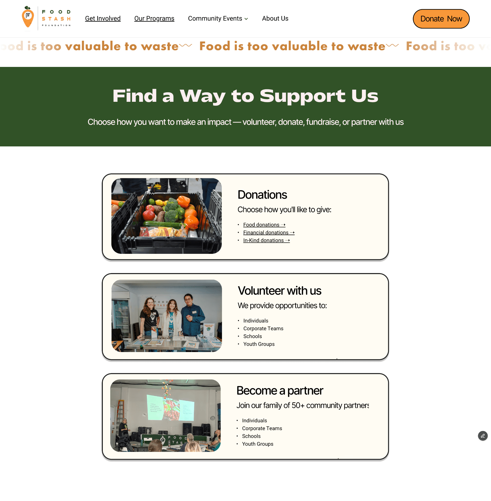
By categorizing the information across pages, we were able to simplify the content structure both within and between pages by grouping relevant pieces of content together.
New Get Involved Page

Restructuring the Information Architecture
Creating a more intuitive experience with 3 key user flows
It was tricky figuring out the easiest way for users to navigate the website. Certain categories tend to overlap with eachother, so it order to tackle the road-bump, my team and I underwent a series of observations and cognitive walkthroughs. This led to a comprehensive context restructure, where we consolidated related programs into logical categories:
For Donors: A clear path for one-time or recurring food donations.
For the Community: A unified "Get Food" portal covering the Rescued Food Box, the Market, and specialized Delivery programs.
For Supporters: Direct funnels for volunteering and financial contributions.
By asking questions such as what kind of information each user category would need, we redesigned the navigation to match how users naturally look for resources or opportunities to give. We moved away from a complex list of programs and instead towards a goal-oriented user flows: receive food, get involved, events. Ultimately reducing the friction caused by similar-sounding categories.
User Flows
Receive Food

Get Involved

Events

The new and improved!
We improved content clarity and scannability by focusing on what core users actually need to make a decision. Instead of overwhelming users with dense paragraphs, we reduced content to the essentials — what the program is, the impact it creates, and key logistical details such as fees or requirements. By prioritizing relevant information that directly supports action, we made it easier for users to move forward with confidence.
Additionally, To reduce the amount of pages a user has to navigate through, we fixed all the relevant programs into one page. We improved content clarity and scannability by focusing on what core users actually need to make a decision — what the program is, the impact it creates, and key logistical details such as fees or requirements.
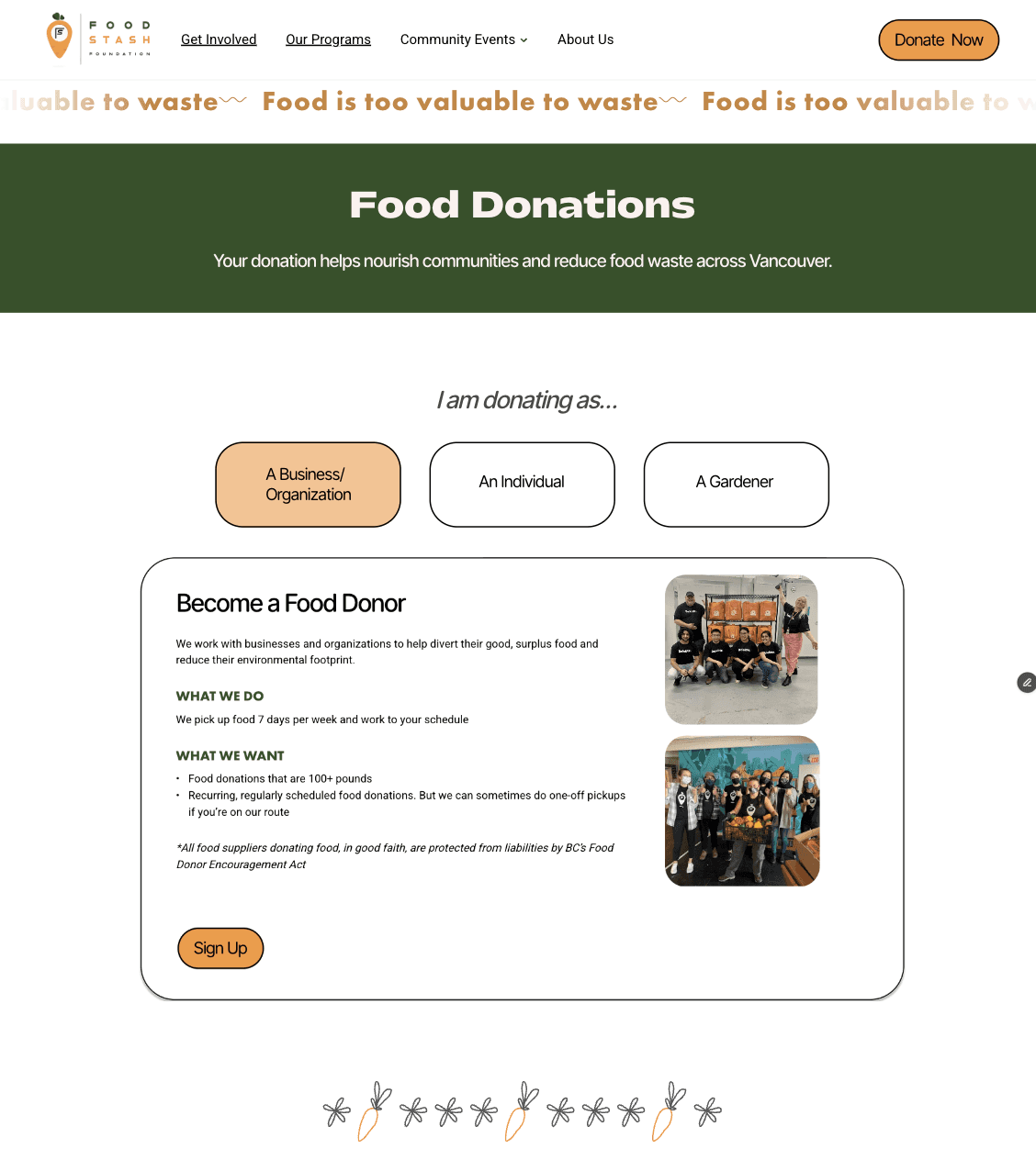
Check out the entire prototype here.
Judge Feedback and Reflections
During the process, we definitely felt the time crunches in the final stretch. Although we invested a lot into our research, the visual polish and design logic weren't as refined as it could have been. We jumped into wireframes a bit too fast without a solid competitive benchmark, which led to a "noisy" hero section and some accessibility hurdles (overlapping text and poor button contrast).
What I Learned :
Having a more iterative process: Although we had some iterative discussion within the team, having a more iterative process would allow us to have more in depth justifications for our design decisions, allowing some parts to be executed more thoroughly to translate user problems into actionable solutions.
Visual clutter and accessibility: Visually, there is room for improvement in making the the choice of imagery, typography, and color shades less cluttered and easier to navigate. Having a more structured design process, improved visual hierarchy, and and enhanced responsiveness can create a smoother, more intuitive experience for users.