Attune x UXhub UXathon


Helping partners become more in tune ♡
Role
Designer
Timeline
January 2026
2 days
Team
3 Designers
Skills
Product Design
User Research
Rapid Prototyping
Overview
Attune is a mobile platform designed to help partners in first-time relationships navigate the complexities of an "always-on" digital culture. It provides a dedicated space for couples to communicate boundaries and personal recovery needs without the fear of misinterpretation.
Understanding the Problem Space
Modern digital culture creates an "always-on" expectation where availability is assumed. We interviewed our friends who were in relationships, and identified three key pain points.
Uncertainty Around Asking for Space
In always-on environments, asking for personal recovery time feels risky
Uncertainty Around Asking for Space
When availability is assumed, silence is easily read as losing interest rather than a need for rest
Uncertainty Around Asking for Space
Care is often measured by responsiveness rather than intent
⭐ How might we help people in first-time college relationships communicate boundaries and recovery needs in ways that signal care, reduce misinterpretation, and feel emotionally safe?
User 1: As a partner, I want a safe, low-effort way to communicate that I need recovery time while signalling care, so I can rest without feeling guilty or misunderstood.
User 2: As a partner, I want a safe, low-effort way to communicate that I need recovery time while signalling care, so I can rest without feeling guilty or misunderstood.
We focused on two representative users to guide our solution.
Paired relies on frequent check-ins, which can feel like pressure when you’re already drained. On the other hand, Gottman Card Decks offers advice, but assumes users have the energy for deep conversations, not ideal for low-battery days.
Competitive Analysis Table

This analysis highlighted the gap for building quick and effective boundaries, while also being able to support deep communication; allowing users to foster a greater sense of trust and security with their partners.
Through competitive analysis, we found that other relationship apps fail to support emotional and communicative boundaries
Shared Signaling
Unspoken boundaries are replaced with shared signaling, making recovery visible and allows partners to see clear intent by replacing silence with context.
Attune supports reassurance through on-tap acknowledgements. Partners can respond with a quick acknowledgement or reaction without starting a conversation This preserves emotional connection while respecting boundaries.
Additionally, Attune reduces the emotional effort of communicating needs through low-effort state setting. When users are already drained, explaining themselves - especially through text - can feel overwhelming or irritating. By allowing users to update their state with a single tap, this removes the pressure to over-explain, reduces guilt, and helps rest feel intentional and respected rather than avoidant.
Shared Signaling
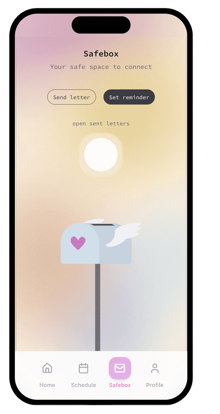
Attune's Safebox feature allows users to send a message to their partner, which can then be opened by pressing the "open sent letters" button at the same time as the other user. This reassures individuals that their emotional needs will be heard and encourages a more meaningful, in-person connection; while also promoting rest.
The Solution: Key Features
Profile + Settings


Onboarding


Scheduling


Other Features in Attune
Next Steps
Looking ahead, Attune can grow beyond first-time college relationships, expanding from moment-based signalling to supporting longer-term relationship rhythms such as scheduling and relationship building features:
Relationship Scheduling: Integrating calendars, reminders, and to-do lists to manage shared time.
Relationship Building: Creating a digital space for storing thoughts and feelings for future, deeper discussions.
Market Expansion: Adapting the platform for long-distance and more mature relationship dynamics.
Looking back, there are a few things that our project could have explored to make it more user focused…
A road block we faced was focusing too much on the prompt, and how our solution can directly align with it. This resulted in overlooking the broader human context of the design, such as prioritizing accessibility a wider range of users as well as more technical aspects such as usability; which are key considerations that I can focus on bringing to future projects.